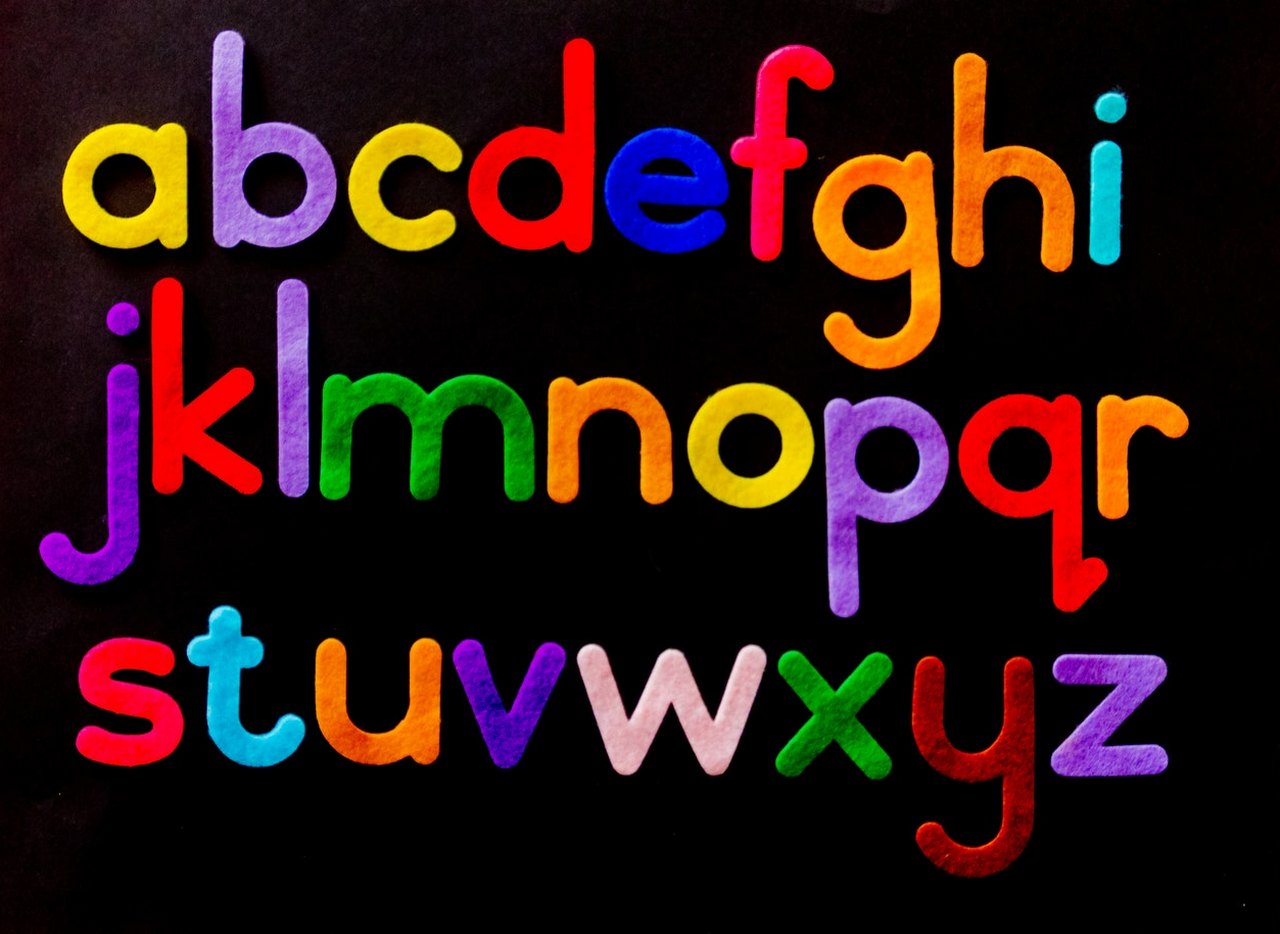
Often the text plays a key role in the composition, so all its details become important: lettering, font, size, colors, additional elements, and so on. So typography in T-shirt design becomes more and more popular and varied. It can act as a basic element of design or complement the composition of illustrations and photographs.
The main purpose of typography in fashion design is to convey a message in an effective way. You can give some word more meaning by using graphic elements and the right font. Also, typography makes people relate to the design more easily. A t-shirt with your own lettering can have a simple, minimalist look and still make you stand out from the people around you.
It’s important that the lettering match the overall style of the garment. You can use the most unusual and bold fonts, as long as they fit into the overall picture and correctly convey the meaning of the text. On the internet you can find a lot of free fonts in the styles: minimalism, comic, classic, 3D, and many others.
Designers do not recommend using more than 3 different fonts in one composition of typography. If an image is used with the text, it is not recommended to use more than 2 different fonts.